
Winston-Salem's Branding: Honoring Heritage, Inspiring Innovation
A City Identity Rooted in Color, Culture, and Community
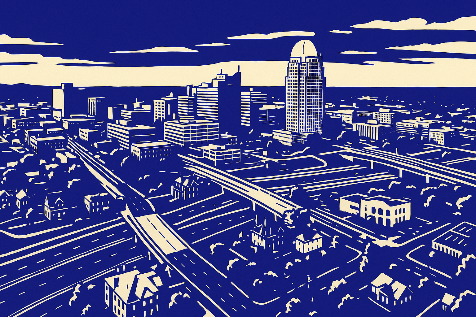
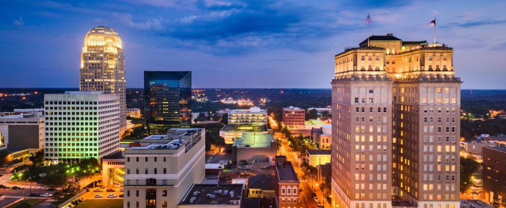
Winston-Salem, North Carolina, is a city of rich contrast—where tobacco warehouses and innovation labs sit just blocks apart, where centuries-old churches share the skyline with modern art installations. It’s a city that knows its past and isn’t afraid to lean into its future. Nowhere is this balance better reflected than in Winston-Salem’s striking city branding.
At the heart of the branding is a thoughtfully curated color palette inspired by the North Carolina state flag—blue, red, yellow, and white—with additional symbolic touches like golden brown for tobacco leaves and dark green for trees. These colors are more than aesthetic choices; they’re narrative tools. They tell a story of legacy industries, natural beauty, and civic pride, all while promoting a dynamic and forward-facing image.
The city’s official logo—a sleek, stylized “W” and “S” in a deep professional blue—anchors this identity. It’s a modern mark that projects trust, stability, and clarity. You’ll see it across government signage, digital platforms, and community initiatives, serving as a unifying emblem that threads through the city’s storytelling. With this iconic branding, Winston-Salem positions itself as a city that remembers where it came from while confidently charting a course toward what’s next.
A Flag that Tells the City’s Story
The official flag of Winston-Salem, adopted in 1962, waves as a fabric summary of the city’s soul. Set against a deep blue field, the flag’s central emblem is an intricate mosaic of colors and symbols. It’s more than just a design—it’s a map of meaning.
The golden brown tobacco leaves on the flag are a respectful nod to the city’s historic role in the tobacco industry, while the dark red buildings represent Winston-Salem’s architectural heritage and industrial roots. Antique gilt scrolls proclaim “Winston-Salem” and the Latin motto “Urbs Condita Adiuvando”—“A city built on helping”—emphasizing a spirit of community and progress. The white elements suggest transparency and openness, while the dark green trees speak to the city’s lush natural surroundings and commitment to preservation.
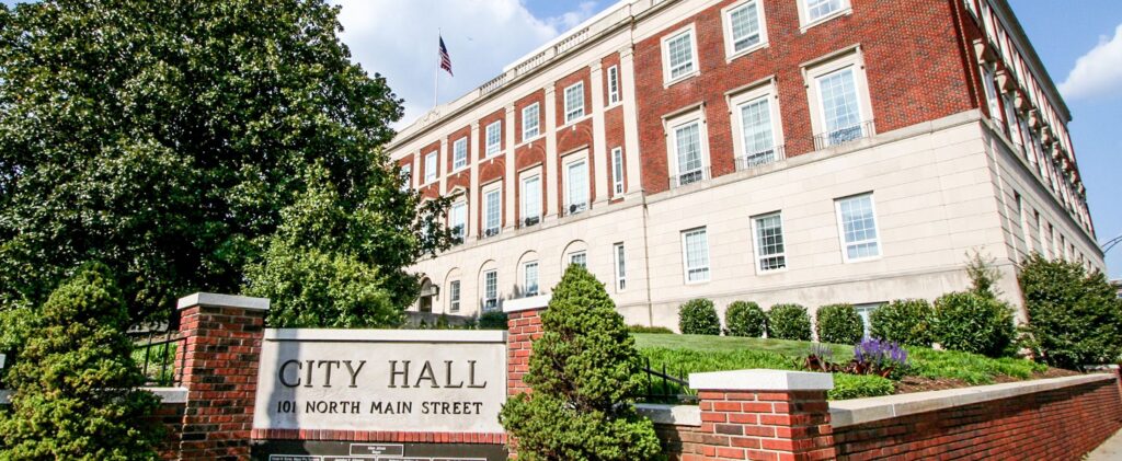
Whether flying proudly at City Hall or featured on digital platforms, the flag reinforces a cohesive identity. It speaks to longtime residents, newcomers, and visitors alike, communicating the city’s values and vision in a single glance.
Branding That Inspires Local Visionaries
Winston-Salem’s identity isn’t confined to municipal websites and government documents—it radiates out into the community and fuels the creativity of local entrepreneurs, artists, and leaders. Case in point: the Winston Salem’s Best Businesses website, whose look and feel was directly inspired by the city’s brand palette.
By channeling the same bold colors and civic themes, the website reflects not only the aesthetics of the city but also its spirit. The use of deep blues, vibrant reds, and heritage golds creates a seamless visual transition from official city branding to community storytelling. It’s a grassroots extension of the city’s message—“We are proud of who we are, and we’re building something even better together.”
This synergy between public branding and private endeavor is exactly what makes Winston-Salem special. It’s a place where city identity becomes a shared language—used by business owners, civic groups, and residents alike to champion their corner of North Carolina.
Legacy Meets Leadership: A Foundation for the Future
Winston-Salem’s branding is more than just colors and logos—it’s a framework for civic pride and a launchpad for future growth. The deliberate design choices tie back to the city’s storied past, including its roots in Moravian settlement, tobacco production, and textile manufacturing. But they also set the stage for the city’s next chapter as a hub for innovation, the arts, and inclusive development.
The professional blue of the city logo speaks to modernity and trust—essential qualities as Winston-Salem attracts new businesses and industries. The historical reds and golds root the city in its legacy, even as downtown revitalization and arts districts signal a forward shift. This branding strategy makes it easy for the city to tell a consistent story across all channels—from tourism materials to economic development presentations.
Whether a visitor is snapping a photo of the city flag or a business is customizing their signage with city-inspired tones, Winston-Salem’s brand is doing what all great city branding should: building connection, inspiring confidence, and telling a compelling, unified story.
Why Winston-Salem’s Brand Matters—And What’s Next
As the launchpad for the Winston Salem’s Best Businesses series, the city’s branding serves as a fitting introduction. It represents everything we want to highlight in our business features: pride in local roots, a commitment to progress, and a shared sense of identity.
In a world where cities compete for attention and investment, Winston-Salem stands out by being authentically itself. Its visual identity—thoughtfully crafted and richly meaningful—reminds us that great branding isn’t about trends. It’s about telling a story people believe in.
For the businesses that will follow in this series, Winston-Salem’s brand will serve as the backdrop to their individual success stories. Together, they form the vibrant patchwork of a city that honors where it’s been and looks forward with open arms.
Add Your North Carolina Business Here...IT'S FREE!
We’d love feature a recommended business!